Ironman Tattoo Ideas — Designs That Earned Every Ink Drop
Ironman tattoo ideas get googled a lot by people who have never crossed a finish line. I know, because I was one of them — sitting in a hotel room the night before my first 140.6, already half-planning what I’d put on my calf if I made it. That felt a little presumptuous at the time. Then I finished, and three days later I was sketching M-dots on a notepad at work. The point is: these tattoos mean something specific and earned, and the designs worth getting are the ones that hold that meaning for longer than the post-race endorphins do. This isn’t a gallery dump. This is about what each design actually represents, what the culture around it looks like from the inside, and how to make yours worth the needle.
The M-Dot — What It Means and Where to Place It
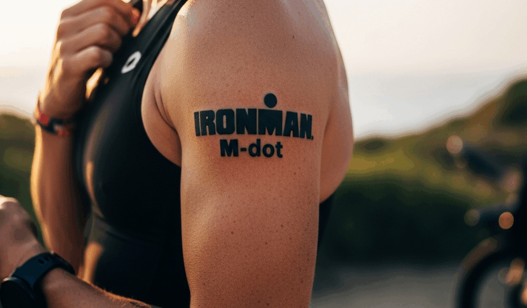
The M-dot is the whole conversation in one symbol. That red circle with a stylized M inside it is the registered trademark of the World Triathlon Corporation, and technically, WTC has been pretty relaxed about finishers tattooing it — it’s widely understood in the triathlon community as the finisher’s mark. You earned it by covering 2.4 miles of open water, 112 miles on a bike, and a full marathon. In that order. Without stopping the clock.
What the M-dot represents isn’t just the race. It’s the 4 a.m. training sessions in November. The long rides where you ate a gas station sandwich on the bike because you miscounted your calories. The swim workouts that felt like drowning practice. Everyone who sees that tattoo and recognizes it — usually another triathlete — understands all of that without you saying a word. That’s rare for any piece of body art.
Placement matters more here than with most tattoos. The calf is traditional, almost protocol. It shows up in finish-line photos naturally since race photographers shoot low, and it’s visible when you’re on the bike. A lot of finishers treat the left calf as sacred real estate for exactly this reason. Shoulder and forearm placements are growing in popularity, especially for people building out a larger triathlon-themed sleeve. Forearm M-dots tend to run about 2 to 3 inches and look sharp in a minimalist single-needle style. Shoulder placements give you more room to incorporate additional elements around the core symbol.
Size recommendation from experience: don’t go smaller than 1.5 inches. I got mine at about 2 inches on the outer calf and at that scale the detail in the logo reads cleanly. Anything under an inch and the negative space starts filling in within five years.
Distance and Time Tattoos
The 140.6 tattoo is the second most recognized mark in the sport, right behind the M-dot. Some people get it instead of the M-dot. Some get both. The number alone — bold, clean, positioned on the calf or forearm — reads immediately to anyone who knows the sport and means nothing to anyone who doesn’t, which some finishers actually prefer. It’s a private badge.
Finish time tattoos are deeply personal and I love them for that reason. Getting your exact time — say, 11:42:07 — permanently inked somewhere on your body is either obsessive or poetic depending on your perspective. In the triathlon world it’s just honest. That time represents an exact snapshot of your body, your training, your race conditions, and one specific day. Fonts matter a lot here. A lot of finishers go with a clean sans-serif — something like Helvetica Neue or Futura — because it keeps the numbers legible at small sizes without the tattoo looking like a digital clock. Script fonts look beautiful but get harder to read as the ink settles over years.
Date tattoos follow a similar logic. Month, day, year of your finish. These often get combined with a small M-dot or the 140.6 number into a compact design that fits in about a 3 by 2 inch space. Minimalist approaches — thin lines, no fill, small scale — have been dominant in the last five years. Detailed, shaded designs with drop shadows and dimensional rendering were more popular in the early 2010s and are making a quiet comeback, but they require a more experienced artist and significantly more healing time.
Probably should have opened with this section, honestly, because most people start here before they know what they want. The time or date tattoo is the anchor. Everything else builds around it.
Course-Specific Designs
This is where Ironman tattoos become genuinely personal rather than just tribal. Every race has a geography, and that geography can become ink. Kona is the obvious example — the lava fields, the volcanic rock coastline, the silhouette of Hualalai in the background. A finisher who earned Kona gets something like that incorporated and it tells a completely different story than a generic M-dot.
Inspired by the specific course, a lot of athletes commission custom designs using local landmarks — a bridge they crossed on mile 80 of the bike, a mountain profile visible from the run course, the pier they swam out from. Ironman Lake Placid has Mirror Lake. Ironman Wisconsin has the Capitol building. Ironman Chattanooga has the Tennessee River bend. These details make the tattoo a map of a specific day rather than a symbol of a general achievement.
Race number incorporation is underused and worth considering. Your bib number from your finish is a data point locked to that race’s records forever. Incorporating it subtly — small, maybe as part of the design’s border or worked into a date format — adds a layer that only you and anyone who looks it up would understand. That appeals to a certain kind of finisher.
Talk to your tattoo artist about reference photos from the course. Bring ten, minimum. A good artist working at a shop like Bang Bang in New York or a custom specialist charging $200 to $300 per hour will do better work with visual references than verbal descriptions every single time.
First-Timer vs Multi-Finisher Designs
First timers often want everything in one tattoo and that’s usually a mistake I’d gently push back on. A single clean M-dot or 140.6 leaves room to grow. The design you get after your first finish should have space — literal, physical space on your skin — for what comes after it.
Multi-finishers have a tradition of star additions. Each star represents an additional 140.6 finish. The M-dot sits at center and stars orbit it, added over years, building into something that documents an entire athletic chapter of a life. Some athletes get a new star after each finish at the same race, tracking their annual return. Others distinguish stars by race — different sizes for different courses, filled versus outlined.
Building a tattoo portfolio over a triathlon career works best when you plan it from the start rather than improvising. A sleeve built around triathlon milestones — first Olympic, first 70.3, first full, Kona qualification — can be extraordinary if the artist is consistent across the work. Going back to the same artist matters. The line weight, shading style, and negative space decisions they make on your first piece should carry through everything that follows. I learned this the hard way after getting two pieces from two different artists that technically look fine separately but don’t talk to each other visually at all.
Placement and Sizing Guide
The calf placement is dominant for a reason. Race photographers shoot from mid-height or below. Your calf is in virtually every finish-line photo you’ll ever have. The tattoo shows up without you doing anything to display it. That matters after a 140.6 — you’re not going to be flexing and posing. You’re going to be stumbling across the line in a mylar blanket while someone puts a medal around your neck, and that calf tattoo will be right there in the frame.
Outer calf works best for bold designs, larger M-dots, and combination pieces incorporating numbers and dates. Inner calf is more intimate and works for smaller, more personal pieces. The flat surface of the outer calf also means less distortion as the tattoo ages — important for anything with fine line work or small text.
Sizing reality check: a 2-inch M-dot with a date line underneath fits comfortably in the outer calf space without overwhelming it. A full course-specific scene with landmarks, distance, and time can run 4 to 6 inches and should be sized to fit the natural muscle shape, not just placed like a sticker. Your artist should stencil it, you should look at it in a mirror with fresh eyes, and you should walk around with it on for ten minutes before committing.
Healing time creates a training conflict that nobody tells you about clearly enough. A fresh tattoo on the calf means no swimming for a minimum of two to three weeks — chlorine on new ink causes fading and risks infection. No direct sun on the piece for at least a month. This means if you’re planning to get inked at the finish line event or the day after, you need to account for what training cycle follows. Most finishers time their tattoo for the week after the race, during the rest period, which lines up perfectly. Aquaphor Healing Ointment, about $4 for a 1.75 oz tube, is still the standard aftercare recommendation from most reputable shops. Use it thin, not thick — a mistake I made my first time that caused the surface to stay moist too long and pulled some ink out of the lines.
The tattoo you get for finishing an Ironman is different from any other tattoo you’ll ever get. Most body art commemorates something you love or something you are. This one commemorates something you did — something specific, measured, timed, and documented. That’s worth treating with more intention than a walk-in flash piece. Take your time with the design. Find the right artist. And if you haven’t crossed the line yet — finish first. The ink will mean more.


Stay in the loop
Get the latest triathlete today updates delivered to your inbox.